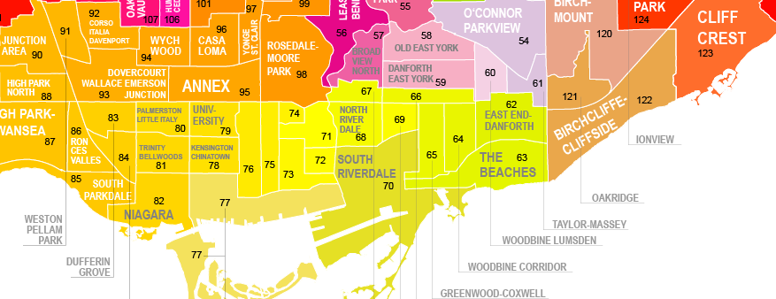
Breaking news!
Wellbeing Toronto has been upgraded. On April 5, we released a major update. This release enhances upon the first version that was launched in 2011. The basic navigation has not changed, but the following new features have been added to significantly improve your experience:
- A new function to map multiple years of data so you can see how neighbourhoods have changed over time.
- You can now click on location points on the map to get more info about them.
- Indicators can be positive or negative ("polarity").
- Many indicators have been updated.
- A number of new indicators have been added including: Watermain Breaks, Salvation Army Donations and our new Language Diversity indicator.
- Data will be updated more frequently throughout this year.
- Video tutorials will now be part of our ongoing commitment to simplify and explain Wellbeing Toronto to a wider audience.
Wellbeing Toronto was developed to meet the needs of a variety of users: decision-makers that need data to support neighbourhood level planning, residents that want information to better understand the communities they live, work, and play in; and businesses needing indicators to learn more about their customers, or planning their business. We hope that these new features and additions will help you to better understand the diversity of Toronto's neighbourhoods!
For more information, please email us at: spar@toronto.ca.