Wellbeing Toronto is an easy-to-use web mapping application that lets you pick and combine all kinds of neighbourhood data. You can view individual indicators – like the total population of seniors – on your map, or combine up to 20 indicators into your own custom index. You can also plot points on the map showing the locations of such landmarks as schools, police stations, hospitals, tourist attractions and more. Finally, you can select specific neighbourhoods and show the indicators just for them. This tutorial will guide you through the steps needed to do all those things.
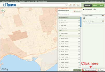
Click Manage Indicators at the bottom-right
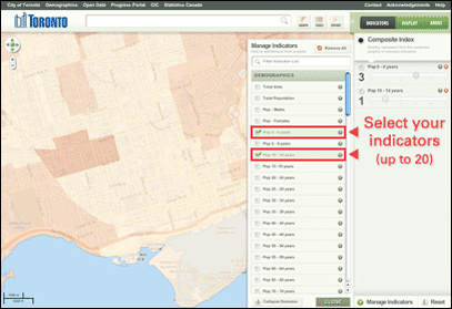
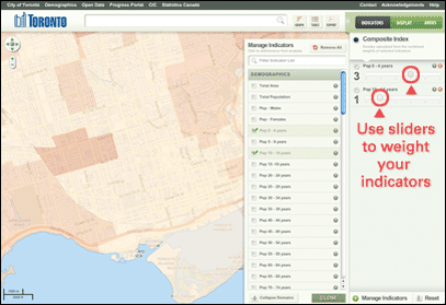
Indicators are organized into domains, click a domain name to expand a list of available indicators. Begin to click indicators to add them to the Combined Score.
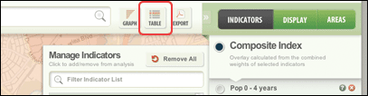
Press the Table button at the top to generate a table showing your Combined Indicator values (1-100) and the raw values for all the indicators you currently have selected. You can export this table to an Excel or CSV file for use on your own PC.
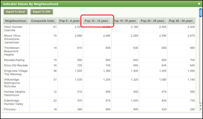
The table shows the Combined Indicator value in the second column from the left. Each column can be sorted by single-clicking on its column name (the name in the area with the light-green tint). Clicking on the Neighbourhood column will sort the neighbourhood names alphabetically.
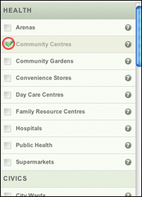
When you select the Display button, you will see a listing of additional layers which can be added to the map. This list contains landmarks such as schools, convenience stores, hospitals and other features whose location may be of interest to you. The list is not exhaustive, and some features are only visible when you zoom in very close to local street level. You can search for specific layers by clicking inside the Filter Layer List area, typing your search terms (such as “social”) and pressing Enter.
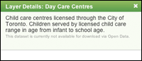
Pressing the ? button on a reference layer will bring up a brief description of the layer’s data. Advanced users can also download the Shapefile for the layer if it is available on the Open Data website (not all layers are available). Additional datasets not visible in Wellbeing Toronto are available on the City of Toronto’s Open Data website at http://www.toronto.ca/open.
Pressing the X button removes an indicator from the Combined Indicator list.
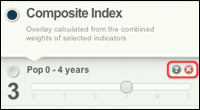
Pressing the ? button opens up the indicator information window.
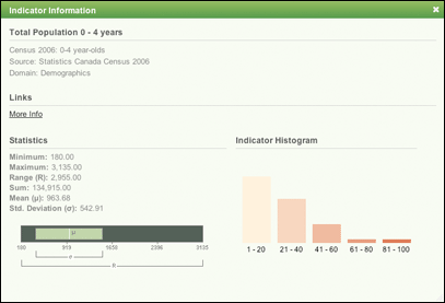
The Indicator Information window gives you statistical information about your indicator and describes its source, date of collection, domain, limitations, caveats and usage recommendations. If more information is available on another website, a link will be provided. The Statistics and Histogram describe how the indicator data is distributed and some other characteristics; these are used by researchers to evaluate the data.
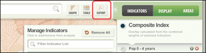
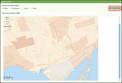
This will bring up the Export window which presents you with several choices. You can give your map a custom title (such as “My Map of Income”) and include the map, histogram (a chart showing the distribution of values within your index), a chart ranking all 140 neighbourhoods by your Composite Index, and a table with all the data inside it. Once you’ve selected all the elements you want to include, press the Export to PDF button on the top-right of the window to create your PDF. You can save to your computer and print it out later. You can scroll down through the window to see a preview of what your PDF will look like. Once you press the Export to PDF button, please be patient; it may take up to 2 minutes to create your PDF.
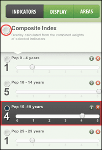
You can view a single indicator by clicking on the individual indicator in the list (Pop 15 – 19 years in the picture) or view the whole Combined Indicator score you created by clicking the top area above the list (Combined Indicator in the picture).
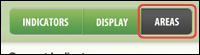
The Areas section allows you to select single or several neighbourhoods and see the indicators just for those neighbourhoods, instead of for the whole city. Click the Areas section to begin.
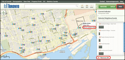
Then, pan around the map and left-click on any neighbourhood you want to add to your custom area. When you left-click a menu appears. Select Add to Custom Area. That neighbourhood is now part of your custom area. You can select neighbourhoods that are not beside each other. Whatever indicator(s) you selected for your Composite Index are now displayed just for your custom area. You can clear the custom area by pressing the Remove All button at the bottom.
You can control the transparency of the map using the slider under the Display section.
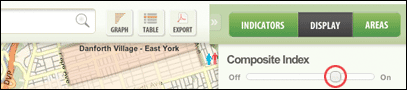
Sliding it to the Off position allows you to see the base map with streets and local features. Sliding it to the On position makes the base map disappear and allows you to see your Composite Index more clearly.
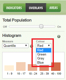
You can change the colour of the map layer (red is the default). The other colour options are Green, Grey, or Blue scale.
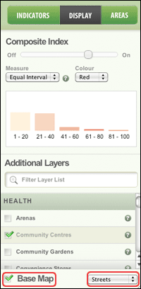
You can also change the base map from a streets view to an aerial photography view, or turn it off entirely.
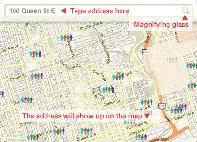
Wellbeing Toronto allows you to locate an address in a simple fashion. Type the address or part of an address in the bar at the top of application, then either press Enter or click on the magnifying glass icon on the right of the bar. The map window will zoom in to the address point.