StART Underpass Program (StART UP) transforms selected underpasses with enhanced lighting, improved sidewalks and walking conditions, pigeon proofing and the removal of weeds. Often, the installation of a mural or street art acts as the catalyst for these improvements. StART UP aims to transform several underpasses per year. The Call to Artists for Expressions of Interest pertains to the mural component of the program only.

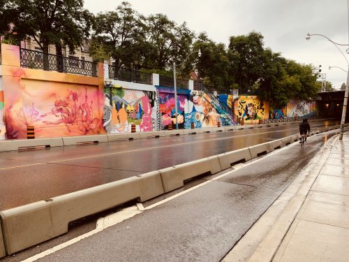
The Lansdowne Underpass Art Project is now complete! Come visit and celebrate the theme of Knowledge Sharing Across Communities that infuses each piece.
More than 30 artists have transformed the east side of the Lansdowne Underpass into a meaningful and beautiful new community asset! This collection of murals share first-person perspective stories that speak to the rich ongoing history of the site as home to many diverse plant and animal species and cultural communities, beginning with the Indigenous peoples of Tkaronto and Turtle Island. The Lansdowne Underpass Art Project creates a collaborative piece that honours this site by telling stories of those who have and continue to live on, play on, build community on, struggle on, learn from, grow in, paint, immigrate to, contribute to, and tend to this land.
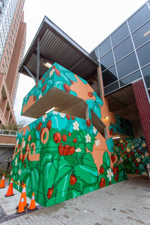
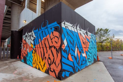
StreetARToronto (StART), a program of the City of Toronto, Transportation Services Division collaborated with project curators Quach George and Chun-Lam Lee to install a mural on the North and South side towers of the King-Liberty Pedestrian Bridge. Quach George is an Indigenous arts programmer from the Absentee Shawnee Tribe of Oklahoma and Mohawks of Akwesasne who resides in tsi Tkaronto. Watch the video here.
The murals are meant to transform the King-Liberty Bridge stairway exteriors into a celebrated community feature representative of the local Indigenous perspective that commemorates the creativity and continued impact of Indigenous artists. The over-arching theme of this project is Land Back.
Artists SJ Okemow (south-side mural) and Kreecha (north side mural) have considered the history of the land and have endeavoured in their designs to reconnect those in the community who use this passage back to the land. As people use this bridge, the murals are meant to take them through a journey that reawakens our relationship with and responsibility to Mother Earth, centering the Land as a reminder to society that it is a human responsibility to build a healthy future together.
The design of the two (2) murals is meant to work cohesively together and complement the existing Star Blanket artwork on the glass panels in the North and South elevator towers by Artist Rebecca Baird, which were produced by Toronto Culture.

“In thinking about this mural project, and specifically the Land Back movement, I returned to the importance of naming the lands we walk on, the stewards of those places, and the importance of naming which communities we belong to. Naming is the first step in knowing and these ideas around naming and language show kinship between BIPOC communities and transcend through the project. The Nehiyawewin word for city is otenaw. A teaching I received was that otenaw means more than just a city, but a collection of hearts coming together. I think this is such a beautiful way to think about cities, that is, not as a series of buildings but as blood. My mural foregrounds this word in syllabics amidst heartberries (otehimin) and their whiteflowers in bloom.

“We are reclaiming our medicine, knowledge, and understanding of our past to create a future meant for indigenous peoples to heal from trauma (land back). In terms of concept, this design seeks to regain awareness of what was lost because of colonization. It is divided into three parts. The colour scheme complements Rebecca Baird’s pre-existing Star Blanket glass art. Entrance Canvas: The design I chose for this wall is a calligraphy patterns to represent balance and health (Cree style). Blue: The west, Earth, the Physical body, dark skin people, and sage. White: the north, air, intelligence (mental), light skin people, and sweetgrass. Yellow: The east, fire, emotional, yellow skin people, and Tobacco. Red: The south, water, spiritual (soul), red-skinned people, and cedar. West-Facing Decks + Tower and East-Facing Decks: Both walls are calligraphy patterns in abstract letter formations which read “all my relations”, which is at first a reminder of who we are and of our relationship with both our family and our relatives”. More than that, “all my relations” is an encouragement for us to accept the responsibilities we have within this universal family by living our lives in a harmonious and moral manner. While these stories are different, each possesses a timeless quality that speaks to some of the essential relationships that exist in traditional cultures – the relationship between humans and the animals, the relationship between humans and the land, and the relationship between reality and imagination”. The seven grandfather teachings and prophecies are represented by seven points. For me, it also means pursuing your dream, which is why I have incorporated my calligraphy style into it.”